Mouse Over Css Effect Stretch Buttons Style For Blogger
Hi Bloggiyan Today I am going to teach you how to make good hover effect buttons for your page,blog or website.As you all know it all starts with Css & HTML.So you should have little knowledge of Css & HTML.Its not very tough to make this god looking hover effect buttons.
If you also want to put this good looking buttons in your blog then follow some quick steps
As I told you that we need the help of Css in making this type of buttons.Below are some Css codes copy that code in your website.
Where To Paste This Code????
If you don't know where to paste this code i will teach you follow the steps.
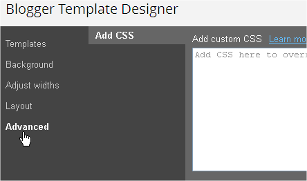
1. Go To Blogger >> Template >> Customise
2. After Opening Template Customise Go To Advanced >> Add Css.
3. And there paste the code.
Paste Following Code In Add Custom CSS Field
a.hupt:link {
color: #6E6E6E;
font: bold 12px Helvetica, Arial, sans-serif;
text-decoration: none;
padding: 7px 12px;
position: relative;
display: inline-block;
text-shadow: 0 1px 0 white;
-webkit-transition: border-color .218s;
-moz-transition: border .218s;
-o-transition: border-color .218s;
transition: border-color .218s;
background: #F3F3F3;
background: -webkit-gradient(linear,0% 40%,0% 70%,from(whiteSmoke),to(#F1F1F1));
background: -moz-linear-gradient(linear,0% 40%,0% 70%,from(whiteSmoke),to(#F1F1F1));
border: solid 1px gainsboro;
border-radius: 2px;
-webkit-border-radius: 2px;
-moz-border-radius: 2px;
margin-right: 10px;
text-align: center;
width: 70px;
transition: width 1s;
-moz-transition: width 1s;
-webkit-transition: width 1s;
-o-transition: width 1s;
}
a.hupt:hover {
color: #333;
border-color: #999;
-moz-box-shadow: 0 2px 0 rgba(0, 0, 0, 0.2) -webkit-box-shadow:0 2px 5px rgba(0, 0, 0, 0.2);
box-shadow: 0 1px 2px rgba(0, 0, 0, 0.15);
width: 160px;
}
Template Code Work Done..
Now where You Want to show this button here is Html code paste the code the button will start appearing.
If You Need Any Help to put this A


